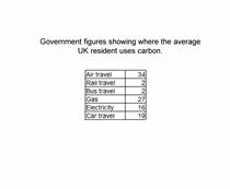
Q.1.
Look at the data illustrated for this question. Which of the following are the mean, median and mode in that order?

-
0%
17.6, 2, 21
-
0%
21.2, 5, 12
-
0%
9.5, 8, 11
-
0%
9.7, 9, 11
Q.2.
The best way of presenting the data in this table would be (the figures are percentages):
-
0%
as a table
-
0%
as a scatter graph with trend line
-
0%
as a pie chart
-
0%
as a population pyramid
Q.3.
Look at the data illustrated. What could the geography student do to improve the accuracy and reliability of their data?
-
0%
Select and record more pebble sizes at each point on the transect
-
0%
Use a larger font for the results
-
0%
Draw a scatter graph with a trend line
-
0%
Choose the largest pebble found within 10 cm of each transect point
Q.4.
The graph shows the annual temperature as recorded at a weather station. In which hemisphere is the station located?

-
0%
Northern
-
0%
Eastern
-
0%
Southern
-
0%
Western
Q.5.
Which of the following statements about the graph is incorrect?

-
0%
2013 was a warmer than average year for the location
-
0%
In 2013, spring temperatures were below average
-
0%
The temperature range in 2013 was 20°C
-
0%
The biggest difference in temperature to the average temperature came in September
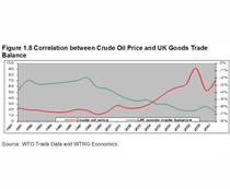
Q.6.
Look at the data presented in the graph. Which of the following statements is NOT false?
-
0%
There is a positive correlation between the crude oil price and the UK goods trade balance
-
0%
There is a negative correlation between the crude oil price and the UK goods trade balance
-
0%
There is a no correlation between the crude oil price and the UK goods trade balance
-
0%
Between the years 2000 and 2010, crude oil prices and the UK goods trade balance have remained constant
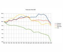
Q.7.
The graph shows how the use of fuels changed over a 20 year period in the USA. How might carbon dioxide emissions have changed?
-
0%
The emissions increased
-
0%
The emissions decreased
-
0%
There was no change in the emissions
-
0%
The use of fossil fuels does not have any effect on carbon dioxide emissions
Q.8.
Which of the following statements about the population pyramid of Austria in 2015 is false?
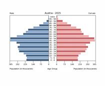
-
0%
Austrian men have a greater life expectancy than women
-
0%
There are more males born than females
-
0%
There are more people in their late 40s than in any other of the age groups
-
0%
This shows that Austria is probably a MEDC
Q.9.
The graph shows the annual temperature as recorded at a weather station. Look at the mean temperature curve. What is the range of the data?
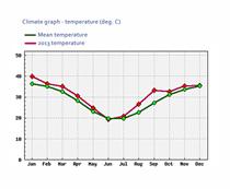
-
0%
16
-
0%
20
-
0%
36
-
0%
40
Q.10.
Two of the population pyramids in the picture represent LEDCs, they are most likely to be:
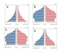
-
0%
A and B
-
0%
B and C
-
0%
C and D
-
0%
A and D