Q.1.
Sam measured himself every month for a year and wrote his results in a table. What would you expect to see?

-
0%
Sam's start height was more than his height at the end of the year
-
0%
Sam stayed the same height all year
-
0%
Sam's height changed by over 2m
-
0%
Sam's start height was shorter than his height a year later
Q.2.
Zak wants to ask his friends about their favourite TV programmes. How could he organise the information?
-
0%
He could send them all a letter
-
0%
He should just try to remember everyone's answers
-
0%
He could write a story about it
-
0%
In a table so he can tally
Q.3.
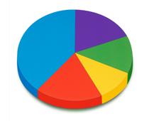
This pie chart shows the colours of swimming costumes in a class. What is the most popular colour?
-
0%
Red
-
0%
Green
-
0%
Blue
-
0%
Purple
Q.4.
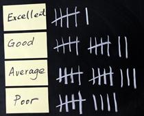
The teacher tallied the quality of homework handed in by her class. How many children handed in 'Good' or 'Excellent' homework?
-
0%
18
-
0%
25
-
0%
22
-
0%
12
Q.5.
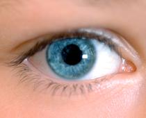
What kind of chart might you use to show the different eye colours in the class?
-
0%
A pictogram - one pair of eyes for each child
-
0%
A line graph
-
0%
A chart
-
0%
Tallying
Q.6.
This graph shows favourite colours in a class. What was the least favourite colour?
-
0%
Yellow
-
0%
Blue
-
0%
Orange
-
0%
Red
Q.7.
When we look at tables, graphs and tallying, it is called...
-
0%
Data Maths
-
0%
Data Grouping
-
0%
Data Drawing
-
0%
Data Handling
Q.8.
How much has been tallied here?
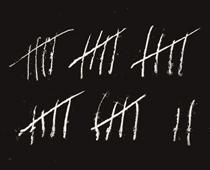
-
0%
18
-
0%
22
-
0%
27
-
0%
20
Q.9.
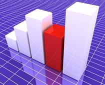
Sam is struggling to read his bar chart. He has labelled the numbers at the side, but what else should he have done?
-
0%
Label each bar along the bottom
-
0%
Coloured them in neatly
-
0%
Made all the bars bigger to see them clearly
-
0%
Turned the graph upside down
Q.10.
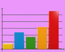
Which colour has the highest value in this bar chart?
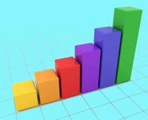
-
0%
Red
-
0%
Purple
-
0%
Green
-
0%
Yellow